
But later, when you sit down to actually give it a whirl, you don't know why your attempt doesn't measure up to the professional version. What gives?
It turns out professional graphic designers have a few tricks up their sleeves to make their work look, well, professional. Even with all the amazing free tools available for wannabe graphic designers these days, amateurs usually don't have the foundational know-how necessary to create consistently polished-looking designs.
To help you out, we've put together a list of seven basic graphic design elements. It's not a graphic design degree by any means, but having a foundational understanding of these seven basic elements can boost your content creation skills and improve your ability to communicate your design preferences if you ever decide to hire a professional.
We deep-dive into the seven elements below, covering what they are, why you should care, and how to use them to create more professional looking designs -- even if you're operating on a zero-dollar budget.
7 Basic Elements of Graphic Design
1) Color
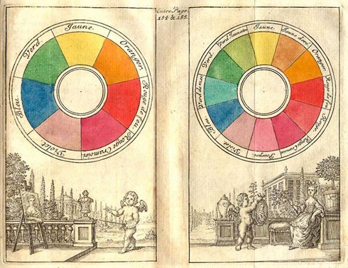
Sir Isaac Newton is widely credited with creating the very first color wheel back in 1706. As the story goes, Newton took the spectrum of colors produced when light passes through a prism (red, orange, yellow, green, blue, indigo, and violet) and arranged them in a segmented circle. When the circle was spun rapidly on a rotating disk, the colors blurred together, appearing completely white to the human eye.
Below, you can get an idea of how Newton's color wheel likely appeared. This 1708 version was illustrated by the French painter, Claude Boutet, and makes reference to Newton's color theory research.
Newton's visual categorization system for color was adopted and expanded upon by scientists, artists, and philosophers over the years, eventually resulting in the modern color wheel we all know today.
The modern color wheel consists of three primary colors -- red, yellow, and blue -- which can theoretically be mixed in varying ratios to produce secondary and intermediate colors. Although modern research tells us that color theory is actually a little more complicated than that, the color wheel is still a valuable tool for graphic designers looking for aesthetically pleasing color combinations.
When selecting hues for a project, consider colors that appear directly opposite or beside each other on the color wheel -- these tend to produce the most consistently pleasing combinations. You could also consider using a free online color scheming tool, like ColorSchemer, to do the work for you.
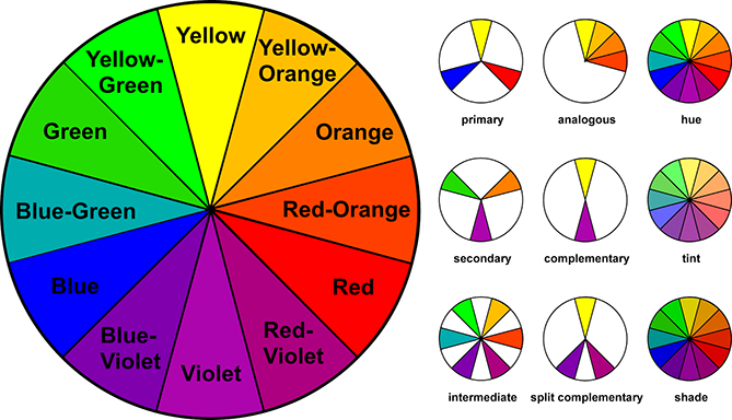
Image via: Lifehacker
Color in Action:
This example from ∆ Studio–JQ ∆ is a great example of complimentary colors in action. Violet and yellow, which appear directly opposite on the modern color wheel, produce a bold, visually appealing effect when paired together.
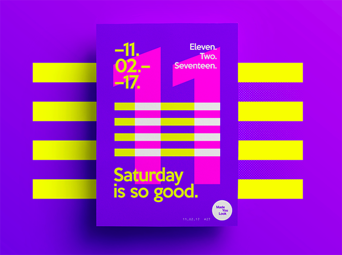
Image credit: ∆ Studio–JQ ∆
2) Line
Lines are more than just dividers -- the right lines can convey movement and emotion, tying together your composition and making it looked polished and professional.
Rikard Rodin, a graphic designer and blogger with over 15 years of design experience, explains that lines can form the underlying architecture of your project. Defining the line of movement in your composition before you get started can help you construct a design that achieves the desired mood.
"You can use mood lines in virtually every element of your design," Rodin writes on his blog. "Or you can contrast different mood lines in different parts of your design to create a more layered design. Take, for example, the 'STABLE' mood line. You can use this in creating your layout. You can use it in your photography. And you can use it in your font selection."
Mood lines don't have to be visible in your final composition -- they can simply act as a guide to provide structure and direction as you work. Of course, line can also be visibly incorporated into your final design as well.

Image credit: ZevenDesign
Line in Action:
Designer Alexander Koltsov and the folks at Shuka Design created this stunning visual identity for the 2016 World Chess Championship in New York. The team used purposeful but asymmetrical swirls of overlapping lines to represent "the thought process of a chess player."
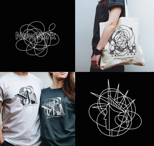 Image credit: Shuka Design
3) Scale
The scale of different elements in a design will have a big impact on how your audience views and makes sense of your composition. Playing with the relative size of different components in your design allows you to set a focal point, highlight areas of importance, and ultimately guide viewers' eyes through the piece.
Scale isn't quite the same thing as size (though many people tend to incorrectly use them interchangeably when discussing design, i.e., "Make the logo bigger!"). Size refers to an absolute measurement (e.g., the sheet of paper 8'' by 11'') while scale refers to the direct relationship between elements in a design (e.g., the circle is twice as big as the square).
You can use scale to create a visual hierarchy for your design. When an element is displayed at a relatively larger scale than the other elements in a composition, our eyes are naturally drawn to it.

Scale in Action:
To create a sense of drama and importance, New York-based graphic designer Aurelio Sánchez Escudero uses a high-contrast scale between elements in these promotional materials for San Francisco's Social Innovation Week.
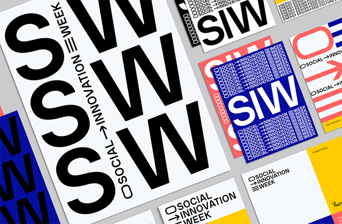
Image credit: Aurelio Sánchez Escudero
4) Shape
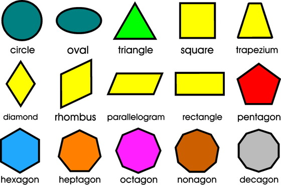
Shapes: they're not just for preschoolers! A shape can be loosely explained as anything defined by boundaries. There are two categories of shapes to consider:
Geometric shapes, which are defined by perfect, uniform proportions (such as a circle, square, triangle), and organic shapes, which have less well-defined edges, free-flowing proportions, and essentially no rules (such as wiggly, blob-like things that don't fit into any real category).
Imgae via: Creative Market
When working on a design, consider both the shapes you're deliberately incorporating (the positive shapes), and the shapes naturally formed around those shapes (the negative shapes).
No comments:
Post a Comment